A lot has happened to and changed when it comes to how programs are listed in the Start menu over the last decade, but developers seem unwilling to move away from last century’s best practices. Old developer habits reduce program visibility and increase clutter in the Start menu for modern Windows.
In Windows 7 and earlier, the Start menu listed folders at the top and all the “unsorted” program entries were all put at the bottom. There would be a tiny competitive advantage in installing a program into a subfolder and thus receiving a higher listing position and more exposure. Even programs that only installed their own program shortcuts would put them inside a subfolder either named after their company or the name of the program. Little attention was given to the added user inconvenience of hiding recognizable program icons inside often cryptically named folders as “everyone else was doing it too”.
Starting with the new Start screen in Windows 8 and 8.1, subfolders of the Start menu were pushed out of sight into the far right of the Start: All Apps screen. Programs installed directly into the Start menu folder itself would receive the more exposed positions on the far left. The old sorting priority for subfolders had been turned upside down. From anecdotal evidence gathered by looking at the software installed on the PCs in my household, developers seem to not have noticed this and kept up the practice of installing their program shortcuts into subfolders.

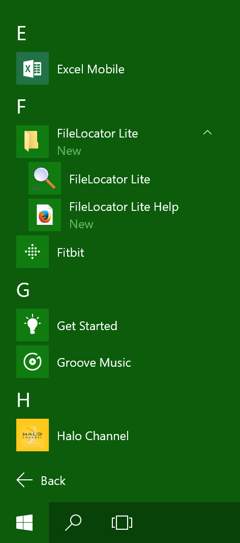
Expanded program folder in the Windows 10 Start menu
The revived Start menu in Windows 10, introduced yet another way of organizing its contents. Although the traditional vertical list of programs has been revived, subfolders and programs are now sorted together in the list. Programs will, of course, still look more inviting than folders as they’ll be accompanied by their recognizable icons.
Searches for program shortcuts using Windows Search or Cortana in Windows 10 no longer match against the paths of the shortcuts’ containing folders. Meaning a search for “Movie Studio” will no longer match against “Sony Movie Studio/Studio 2014.lnk” in the Start menu. This change makes it harder to find software that haven’t yet stopped hiding their icons inside subfolders.
It should be mentioned that some programs include a few other — mostly useless — options along with the program shortcut in their Start menu subfolder. Items like a link to their Documentation website and a shortcut to uninstall the program. Why they don’t consider having the uninstallation option given the same amount of user-exposure as the main way to launch the program either demonstrate a self-destructive attitude or little faith in users’ willingness to stick with their programs. Losing these add-on items in the Start menu can’t be considered a loss to either users or the overall experience of the software. Again turning to anecdotal evidence from my own PCs, I found that many of the help and documentation links lead to Not Found error pages or were otherwise not maintained.
The only situation where installing software into a subfolder still makes sense is for big software suites consisting of five or more components. Distributing software this way these days is limited to the likes of Microsoft Office, LibreOffice, and Adobe. Then again, maybe users would prefer having Excel listed in their Start menu under “E” and Word under “W” rather than having to remember that they’re both hiding under “M” inside the Microsoft Office folder with the generic folder icon.