Ten months ago, I reviewed the Moto 360 from Motorola with Android Wear. I wasn’t too happy with neither the smartwatch itself nor the Android Wear platform. I’ve now had Android on my wrist for a year, and I can’t say I’ve found it all that useful.
I’ll start by revisiting some of the points about the Motorola Moto 360’s hardware that I mentioned in my review, and then go on to discuss the Android Wear platform more in general.
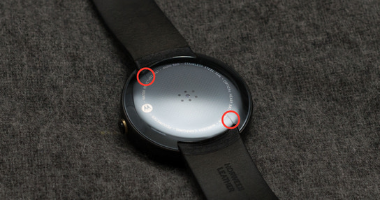
The watch itself has kept well throughout the year. I was worried about the durability of the leather strap but it has held up remarkably well. I’ve gotten two cracks in the plastic housing on the back of the Moto 360 (pictured below) which appeared after I accidentally rammed the watch glass front first into a closing tram door.
Remarkably, there are no scratches or signs of wear either on the glass front nor anywhere else on the casing or even the strap. It looks pretty much like it did out of the box.
The battery was the one big concern every other reviewer raised when I bought the Moto 360. As stated in my review, I didn’t have any issues with the battery. My overall experience after a year of daily use is that it will usually have 15–30 % battery left at the end of a day. Occasionally, it will randomly run out of battery in the middle of the afternoon but I don’t understand why that happens.
I can only conclude that the Moto 360 has a higher quality build than I thought it would have. However, that still leaves the question of how useful — if at all — it has been. The first thing I did when I sat down at my desk to write this review was to unstrap and remove the Moto 360 from my wrist. It keeps hindering my arm movements by colliding with either the edge of the table or the base of the laptop. I’ve got the exact same problem with traditional watches and other wristwear, but the difference is that I’ve chosen not to use those.
The watch’s screen keeps turning on and off when I do other things and I find this incredibly distracting. There’s a special flicking wrist motion that’s supposed to turn on the screen as you lift it up towards your face to see the time, and this is unintentionally triggered all the time. These random flashes of light on my wrist have been a constant source of annoyance and distraction. I keep glancing down at it, trying to determine whether it was trying to show me an important notification or just being annoying. This isn’t the Moto 360’s fault, as users of other Android Wear smartwatches have the exact same complaint. It’s an awkward and theatrical gesture and it’s easily triggered by accident.
The Moto 360 received one update about six weeks after my review, and haven’t received anything in between then and the big Android 6 update that dropped in February this year.[1] Motorola now lists the first-generation Moto 360 as discontinued, so I don’t expect it to receive any further software updates.

Only visible wear after a year of daily use.
I’ll just come straight and tell it as it is: Android Wear is useless at its best and seriously distracting at its worst.
The big promise of Android Wear was that you don’t need to pull up your phone all the time. Instead, you can just glance at notifications on your wrist without pulling too much attention away from other things you might be doing. This doesn’t at all work in practice. You don’t get to see the full text of the notification and have to swipe and interact with a screen on your wrist instead of the screen in your pocket.
It’s also harder to ignore the screen on your wrist as it lights up and calls for not only your attention, but the attention of anyone you might be talking to as well. The small wrist-worn screen is also generally hard to use, so you start off by fiddling with it to stop it from drawing attention to itself only to pull your phone up in frustration after a few failed attempts at figuring out what the watch wanted from you.
When you receive calls, your watch starts vibrating and showing a swipe-left to answer or swipe-right to hang up animation. At the same time, your phone starts ringing and vibrating. Now, if you answer from your watch you’ll still have to extract your phone from your pocket to talk to the person on the other end. However, if you answer from your phone your watch will still animate and vibrate for a good 10–30 seconds after answering. It’s quite hard to concentrate on what someone is trying to say to you while your wrist is flashing and vibrating.
In February, Google announced a big upgrade to the Android Wear platform from Android 5 to Android 6.[2] The update didn’t include much in terms of features or improvements to the overall user experience. The small set of new features constituted little more than some flashy show-off features to catch-up to the Apple Watch.
The two killer apps for Android Wear have proven to be “OK Google, countdown 25 minutes” when cooking and “OK Google, flashlight” when I’ve got my arm half a meter in a dark cabinet or tangled up in the nest of cables behind the computer or the multimedia bench. These uses alone aren’t enough to justify wearing an Android Wear device on my wrist all the time.
There are a growing number of apps that integrate with Android Wear, but they’re generally unintuitive and awkward to work with. These apps use a mismatch of exact spoken phrases and touch input while they expect you to remember how they work with few visual queues.
An app I’ve been motivated to use is Glucosio, a utility for recording glucose levels throughout the day as part of diabetes management. Their Android app is kind of slow and clunky to use, so recording new measurements with voice commands directed at my wrist rather than open up the app and manually inputting them sounds like a thing Android Wear would be perfect for.
I say, “OK Google, launch Glucosio.” and my watch shows me search results on the web for “Google CEO”. Not quite right. After another two–five more tries and Glucosio opens with a screen showing a listening microphone icon which is identical to the main voice input screen that I just gave a command to. Did the app open? or did the Google Now screen crash and restart?
I say “5 point 9” and the numbers show up on the screen and Glucosio lets me know that a new measurement has been recorded. I also get a second dedicated notification on the watch and on the phone about a new measurement of 5.9 having been registered. Like the other apps that integrate with Android Wear, it definitely does work but the interaction doesn’t feel natural and a small task that should have been quick to complete often ends up taking one-two minutes to complete.
My experience here with Glucosio is similar to the experiences I’ve had with every other third-party app that ships with an Android Wear component. Many apps don’t recognize the standard swipe from left-to-right gesture to quit an app, and I end up wasting time with it trying to fool the app to not recognize and hijack the gesture to allow the system to close it. These apps, of course, also prevent the default screen dimming timeout so the watch doesn’t power down the screen; requiring me to figure out how to close it or risk running out of battery quickly.
These issues aren’t limited to just the Moto 360. None of the other Android Wear smartwatches that have been released to market have received overwhelmingly positive reviews from other critical reviewers. The problem is with the limited potential and nature of the Android Wear platform itself. We can’t expect too much of it, and currently, it doesn’t deliver features or apps that have proven useful.
An Android Wear device has to be recharged every night and it requires more attention and upkeep than a regular wristwatch. Even after a year, I still pull out my phone to check the time rather than look down on my wrist. To me, my Android-powered phone has a more proven and consistent experience for telling the current time than I’ve ever had with an Android Wear watch.
